Custom call logo opinion

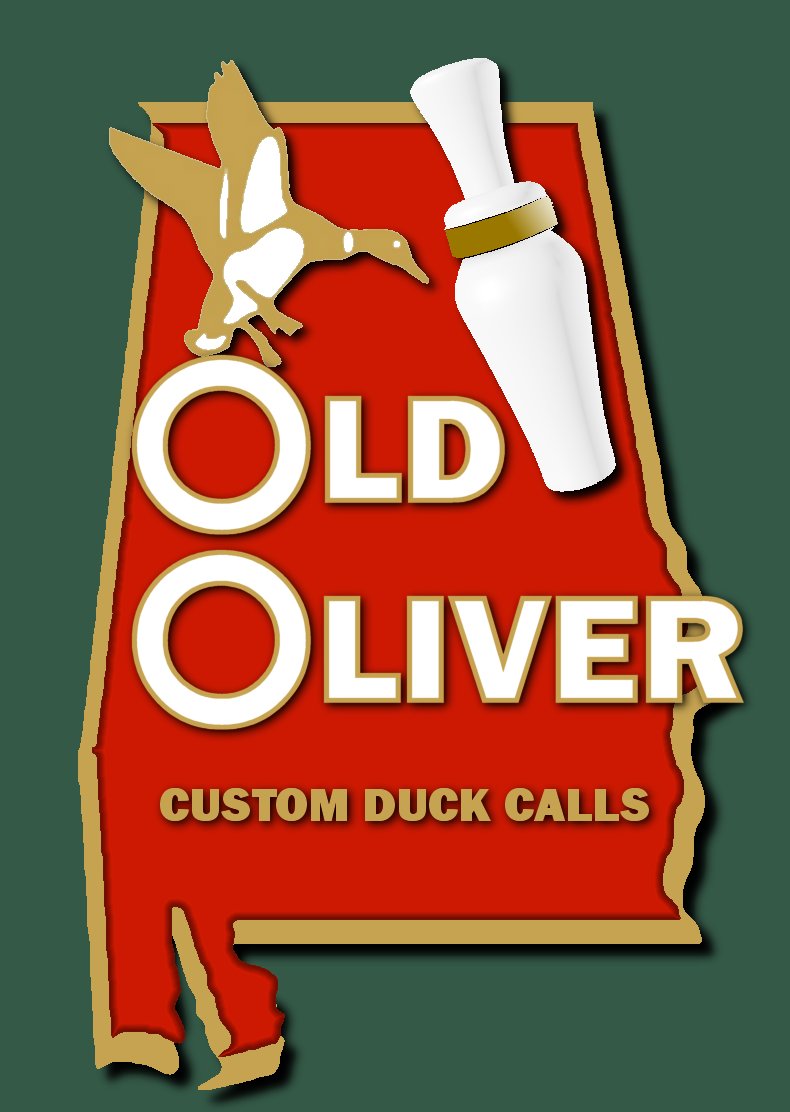
Here is another variation. Several of you mentioned incorporating Alabama so I took Scott's advice and used a new badge shape. I also swapped the call out for one I drew in CAD that is a more traditional shape based on folks positive reaction to the vintage look of the logo.

I'm really undecided if I've improved or taken away so I'd love to hear what you all think. I'm getting faster at working the design so changes are coming easier. One thing I could do is CAD the call with a wood grain since I work in wood, but the white just sort of pops to me eye. Love to hear more suggsetions.


That's very cool. I like the Alabama part of it. That, however, will sell less calls than the original logo, I bet.

Ed.
 
Ed

Very interesting comment. Could the same be said for Mississippi? :) Actually I think I see your point that associating to one state or area might not be as inviting as a call that is nonspecific to region.
 
Last edited:
You nailed exactly what I was thinking...I am biased but I think thats very cool


"Sweet HOME Alabama..." :)
 
...as to the geography of it all...I like pointing out to my hunting buddies that my Dave Larsen IOWA call is what it is and its way cooler than what they can buy at Cabela's...I think that would be the same with my Eric Patterson ALABAMA call

So I will take one...let me know how much it is
 
and ask Lou Tisch about Larsen's Iowa calls...he tried mine and made it sing right then and there...these guys and their special skills are a hidden treasure...you are not going to find that at Cabela's or Gander Mountain or "Cheaper than Dirt"
 
Dutch

Here's your pic. Thanks for taking a shot at the logo. I see what you mean about simple and making an impression that sticks. In your opinion Is mine too far from that. Keep in mind the logo I'm showing is the full size one that would be used on a web page. I am boiling it down to a simpler form for decals that will be applied to the call and used when a smaller design is needed.

View attachment OldOliverDutch.jpg
 
I like the original one the best. If you are going to go with shape around the logo, I think the naked lady silhouette that the truckers have on their mudflaps would be better than any state when it comes to selling calls, but that's just me...

Seriously, I like the first one the best, nice and simple.
 
Most certainly that could be said about Mississippi. I personally like the Alabama logo better, but having spent 8 years in the Northwest I have a feeling for the psychology of non-southerners, and to many of them red states have negative connotations. I'll bet you can sell all the calls you can turn out whatever logo you pick, so I would probably go with the Alabama logo anyway, just because it looks better to me.

Ed.

"I hope Neil Young will remember a southern man don't need him around anyhow."
 
Eric,

I still like your original version the best with the exchange of the duck call shape and profile to what you prefer. In the perspective of keeping it simple, I would nix the woodgrain idea and just use the basic white with the outline. Actually more important than the logo, is your selection of "pro staff" and where do we sign up for our free gear and sponsored trips????????
 
I like the first one and the one Dutch drew. Kiss.... You also can put on "champion ship calls". Then your son will be involved.
 
Eric,

I like the logo showing the state outline...You might think about adding a small star or spot to signify the actual location of where the calls are made...On my logo that I had Terry make is two little lines located on the Western end of the state of Kentucky...In my mind the logo represents the Kentucky and Barkley Lake...The lakes I grew-up hunting on the most...

Good luck with your decision...

Kristan
 
Eric I must be thinking like Brad stack the O's and put a bead on them or lower the duck and put cross hairs in the O. John
 
Eric,
The call logo looks great, if you bring the two letter O's together (like an over and under) and add the shell bottom brass in the center of the o's (like the globe is in the oliver original) with some text like the "Paterson" brand shell or something like that.

Just a thought, Looks great with or without state outline (although Hadel calls have a Louisiana state outline I think).

-Jack
 
Hey Eric,

Great looking logo. Hey, have you made any Reelfoot Lake style calls? I like the looks of those long, tapered barrels. If you make one in walnut, I might be interested in buying one from you. Got any pics of calls that you have made?


Best,
Nate
 
Thanks again for the suggestions. The one about making the Os shotgun shells is really popular. I'll see if I can make it work.

Nate, I have a bunch of Walnut just about ready to turn and plan on making a batch. I'll let you know when I do. No pics yet. Like I told Jonathan in a PM I've not taken any pictures yet and am still trying to get my barrel shape nailed down before I start posting pictures. So far I'm doing Ark style calls, no Louisiana or Reelfoot yet calls just yet. At this point progress is slow. We are doing travel baseball tournamants and that is taking up a lot of time that would otherwise be spent in the shop. All in due time.....
 
All I want to know is whether this means that you'll have to start dressing like and outlaw biker and have your own prostaff?

Like the one with the state the best (obviously). Says something about you. It probably could result in a reduction is sales, but is that what you're in it for? Aren't the guys you're making these things for primarily guys who know you? It'd serve to remind them where the thing came from.
 
Eric, what's my old oliver duck call pro-staff decal going to look like? just trying to figure out where on my car it will look best. HAHA
 
Back
Top